Devoted to Virtualization Technologies

Site to share knowledge about VMware and related Technologies

How to Share Dashbaord in vCOPS

Sharing Dashboard is one of the cool features available in vCOPS. You need to have Advance or Enterprise Edition to get Dashboard functionality. For more information about vCOPS features and their editions,  please click here

We are going to use the Local user account for this blog. I will write another blog for LDAP access. We would need two things here.

  1. Create the necessary Groups and User account
  2. Create the Dashboard, Share it and assign it to the group

Steps to create local user account

  1. Go to custom Dashboard URL
  2. Click on Admin -> Security
  3. The following screen will be displayed
  4. Security User ManagementSecurity User Management
    Click to enlarge
  5. Click on Add New Group
  6. New GroupNew Group
    Click to enlarge
  7. Fill in the Group Details
  8. Group DetailsGroup Details
    Click to enlarge
  9. Click on the Group Testing
  10. New Group AddedNew Group Added
    Click to enlarge
  11. Add a new user for that group. We are using local user accounts here
  12. User AdditionUser Addition
    Click to enlarge
  13. Fill in the User Account Details
  14. User DetialsUser Detials
    Click to enlarge
  15. Now you have added the user information to the group

Sharing the Dashboard

  1. Select the Dashboard
  2. Click on the Share link, just below the Dashboard
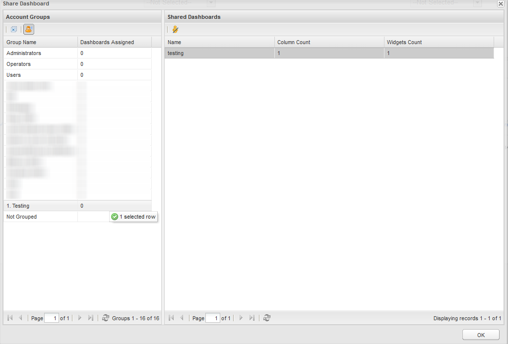
  3. Share DashboardShare Dashboard
    Click to enlarge
  4. Drag the Dashboard from the left, to the Testing Group, what was created earlier.
  5. Shared Dashboard listShared Dashboard list
    Click to enlarge
  6. Once, the Dashboard is shared, you will see a yellow icon next to the dashboard name
  7. Yellow IconYellow Icon
    Click to enlarge
  8. Now, you access the custom url with the local username and password that was created earlier, you will see the shared dashboard.

There is more to this, you can give necessary permission on the dashboard for the users. That warrants for another blog entry Smile

Badges in vCenter Operations Manager

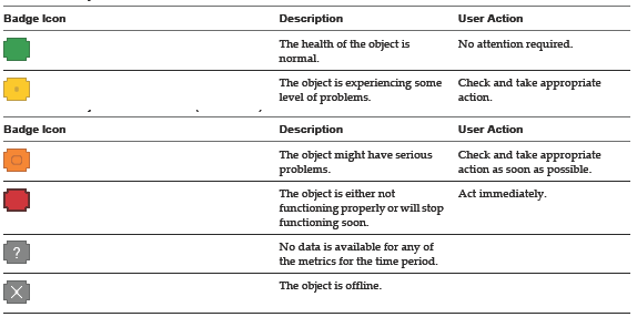
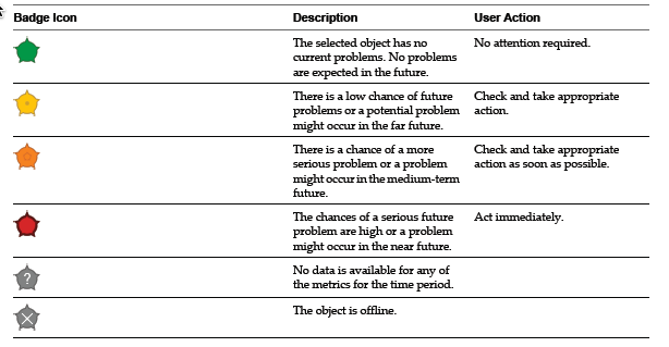
Badge in vCenter Operations Manager

vCenter Operations Manager uses badges to illustrate derived metrics to provide an overview of the state of the virtual environment or an individual object. These badges serve as focus points to narrow the scope of a potential problem and provide details about the cause of the problem.
vCenter Operations Manager provides major and minor badges that are color coded and range from a healthy green to a potentially problematic yellow, orange, or red.

Scores might reflect a healthy state or a potential problem depending on the type of badge. For example

  1. Low scores for health, time remaining, and capacity remaining might indicate potential problems.
  2. Low scores for faults, stress, or anomalies indicate a normal state.

There are 3 Major badges

  1. Health Badge
  2. Risk Badge
  3. Efficiency Badge

Health Badge

Health badge serves as the first high-level indicator of the state of the virtual environment. The Health badge indicates immediate problems that might require your attention. It helps you identify the current health of your system.

The overall health score for an object ranges from 0 (bad) to 100 (good). vCenter Operations Manager calculates the Health score using the scores of the sub-badges that the Health badge contains. The badge changes its color based on the badge score thresholds that are set by the vCenter Operations Manager administrator.

vCOPS Health WidgetvCOPS Health Widget
Click to enlarge

There are 3 minor badge;

  1. Workload Badge
  2. Anomalies Badge
  3. Faults Badge

Faults are given precedence in the Health score because they describe existing problems, while Workload and Anomalies are combined to identify performance problems. This approach ensures that the score of the Health badge reflects the actual state of the object, without overexposing or underestimating problems.

Workload Badge

The vCenter Operations Manager Workload badge measures how hard an object must work for resources. A workload score of 0 indicates that a resource is not being used and a score that approaches or exceeds 100 might cause performance problems.

The Workload score ranges from 0 (good) to over 100 (bad). The badge changes its color based on the badge score thresholds that are set by the vCenter Operations Manager administrator. Both Anomalies and Workload are useful when attempting to find a probable cause and troubleshooting performance problems

Workload badgeWorkload badge
Click to enlarge

Anomalies Badge

Anomalies badge measures the extent of abnormal behavior for an object based on historical metrics data. A high number of anomalies might indicate a potential issue. A low Anomalies score indicates that an object is behaving in accordance with its established historical parameters. A high number of anomalies usually indicates a problem or at least a situation that requires your attention.

Both Anomalies and Workload are useful when attempting to find a probable cause and troubleshooting performance problems. The Anomalies score ranges between 0 (good) and 100 (bad). The badge changes its color based on the badge score thresholds that are set by the vCenter Operations Manager administrator.

Anolamies BadgeAnolamies Badge
Click to enlarge

Faults Badge

Faults badge measure the degree of problems that the object might experience based on events retrieved from the vCenter Server. The events that might generate faults include the loss of redundancy in NICs or HBAs, memory checksum errors, high availability failover, or Common Information Model (CIM) events, which require your immediate attention. The Faults score ranges between 0 (no faults) and 100 (critical faults). The badge changes its color based on the badge score thresholds that are set by the vCenter Operations Manager administrator.

Faults BadgeFaults Badge
Click to enlarge

Risk Badge

Risk badge indicates a potential performance problem in the near future that might affect the virtual environment. vCenter Operations Manager calculates the risk score using the scores of the sub-badges that the Risk badge contains. The overall Risk score for an object ranges between 0 (no risk) to 100 (serious risk).

Risk BadgeRisk Badge
Click to enlarge

Ther are 3 minor bardges under Risk Badge

  1. Time Remaining Badge
  2. Capacity Remaining Badge
  3. Stress Badge

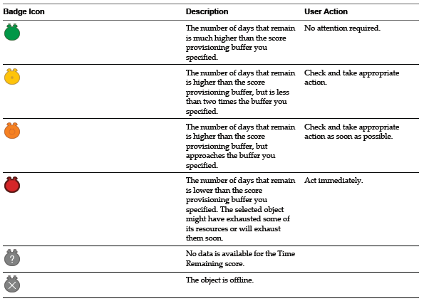
Time Remaining Badge

Time Remaining badge measures the time before a resource associated with an object reaches capacity. This badge indicates the available timeframe to provision or load balance the physical or virtual resources for a selected object. The Time Remaining score ranges between 0 (bad) and 100 (good).

Time Remaining BadgeTime Remaining Badge
Click to enlarge

Capacity Remaining Badge

Capacity Remaining badge measures the number of additional virtual machines that the object can handle before reaching capacity. The remaining virtual machines count represents the number of virtual machines that can be deployed on the selected object, based on the current amount of unused resources and the average virtual machine profile for the last “n” weeks. The remaining virtual machines count is a function of the same compute resources of CPU, Mem, Disk I/O, Net I/O, and Disk Space that are used to calculate the Time Remaining score. The Capacity Remaining score ranges between 0 (bad) and 100 (good).

Capacity Remaining BadgeCapacity Remaining Badge
Click to enlarge

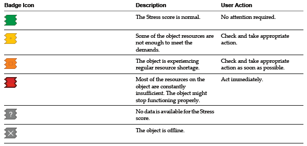
Stress Badge

Stress badge measures a long-term workload that might involve undersized virtual machines or ESX hosts or an excessive number of virtual machines. These conditions might generate performance problems over time. The Stress score helps you identify hosts and virtual machines that do not have enough resources allocated, or hosts that are running too many virtual machines. A high Stress score does not imply a current performance problem, but highlights potential for future performance problems. The Stress score ranges between 0 (good) and 100 (bad).

Stress BadgeStress Badge
Click to enlarge

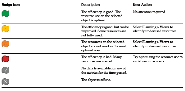
Efficiency Badge

Manager Efficiency badge identifies the potential opportunities to improve the performance or cost of your virtual environment. Efficiency accounts for the waste and infrastructure density in your environment. A large amount of wasted resources combined with a low density ratio generates a poor efficiency score. The Efficiency score ranges between 0 (bad) and 100 (good).

Efficiency BadgeEfficiency Badge
Click to enlarge

There are 2 Badges under Efficiency Badge

  1. Reclaimable Waste Badge
  2. Density Badge

Reclaimable Waste Badge

Reclaimable Waste badge accounts for resource types such as CPU, memory, or disk, and measures the extent of excessive provisioning for an object. It also identifies the amount of resources that you can reclaim and provision to other objects in your virtual environment. The Reclaimable Waste score ranges between 0 (good) and 100 (bad).

Reclaimable Waste BadgeReclaimable Waste Badge
Click to enlarge

Density Badge

Density badge measures consolidation ratios to assess cost savings. You can assess the behavior and performance of a virtual machine and related applications to maximize the consolidation ratio without affecting the performance or service level agreements. The Density score ranges between 0 (bad) and 100 (good).

vCOPS Density WidgetvCOPS Density Widget
Click to enlarge

vCenter Operations Manager Basics

vCenter Operations Manager (vCOPS) collects performance data from each object at every level of your virtual environment. It stores and analyzes the data, and uses that analysis to provide real-time information about problems, or potential problems, anywhere in your virtual environment.

It provides following function

  • Combines key metrics into single scores for environmental health and efficiency and capacity risk.
  • Calculates the range of normal behavior for every metric and highlights abnormalities. Adjusts the dynamic thresholds as incoming data allows it to better define the normal values for a metric.
  • Presents graphical representations of current and historical states of your entire virtual environment or selected parts of it.
  • Displays information about changes in the hierarchy of your virtual environment. For example, when a virtual machine is moved to a different ESX host, you can see how these changes affect the performance of the objects involved.

Definition

Attributes – Each type of data that vCenter Operations Manager collects is called an attribute

Metrics – An instance of an attribute for a specific inventory object is called a metric. For example, free memory for a specific virtual machine is a metric

Metric Value – Each piece of data that vCenter Operations Manager collects is called a metric value

Dynamic Thresholds – vCenter Operations Manager defines dynamic thresholds for every metric based on the current and historical values of the metric. The normal range of values for a metric can differ on different days at different times because of regular cycles of use and behavior.

Hard Thresholds – Unlike dynamic thresholds, hard thresholds are fixed values that you enter to define what is normal behavior for an object. These arbitrary values do not change over time unless you change them manually.

Key Performance Indicators – vCenter Operations Manager defines attributes that are critical to the performance of an object as key performance indicators (KPI). KPI are weighted more heavily in the calculations that determine the health of an object.

Metrics Concept – To get more information about this, please click on the following link

Object Type

vCenter Operations Manager uses specific icons so that you can distinguish between virtual machines, ESX hosts, and other objects in the inventory. All these objects will be monitored via inventory pane in vCOPS

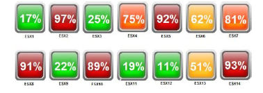
Use HeatMap in vCOPS to get free disk space

vCOPS has lots of features and a big learning curve is involved here. This product is not that matured but still it is extremely helpful for the organization.

There are multiple ways through which, you can get free disk space inside a VM. I was playing with it and finally, I was able to get it right. I will be eager to learn/see how others have implemented this solution in their environment.

I wanted, following information for our environment.

  1. Free disk space for C:\
  2. Free disk space for D:\
  3. Aggregate free disk space for the VM.

I tried, this only for Windows machine, but this should not be difficult for any other type of OS.

Steps that you need to follow

  1. Go to custom Dashboard – i.e https:\\ip_of_ui\custom
  2. Click the “+” for the New dashboard
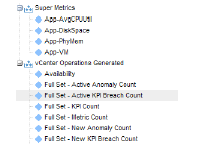
  3. Select Executive 2 Template  and drag Heat Map along with Geo Widget
  4. Give Storage 1 as the “Tab Name”
  5. Click “ok”
  6. Delete the Geographical Map from the Dashboard by clicking “close widget”
  7. Click Edit on Dashboard Tools
  8. Change the column to 1
  9. Click “OK”
  10. Now, you have a complete Dashboard just for this widget
  11. Click on “Edit Heat Map” Widget
  12. Change the Widget Title from “Application Heatmap by SILO” to what ever you think makes sense to you
  13. Change the settings. You can see the screen shot.  The trick to save the configuration is first to click on the plus sign and give it a name., I learned it the hard way :)
  14. The trick here is the min and max value. In this case, I have selected 15 and 30. That means, that anything close to 30 and above should be in “red”. This can help you to understand the VMs that are hoarding disk space. We can clearly go for thin disk inside the VM and save that space. But, that is all together a different conversation Smile
  15. C drive Free SpaceC drive Free Space
    Click to enlarge
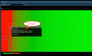
  16. Once you click on “OK” you will see something like this
  17. 48 GB free disk space48 GB free disk space
    Click to enlarge
  18. The above screen clearly shows the VM name and the disk space used by them. We should look closely for the VMs that are in “Red”
  19. Let’s try to get the aggregate for all the drives. This will help us to understand overall disk free space in each VM.
  20. Aggregate Free SpaceAggregate Free Space
    Click to enlarge
  21. Once, you click on “OK”. You will get the over all disk usage for each VM
  22. Agg free disk spaceAgg free disk space
    Click to enlarge

I am sure, management will be very happy to see who is taking more most disk space in their environment.

Understanding Widgets in vCOPS

All though I am using vCOPS On and Off for last couple of months. I thought, a short description of each widget will help to remember, what they do and how we can use them in the dashboard.

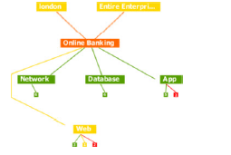
Advanced Health Tree Widget
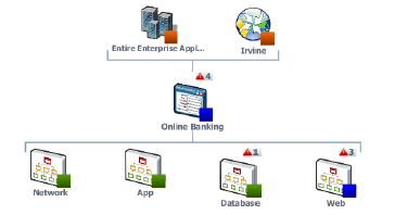
The Advanced Health Tree widget shows the section of your resource hierarchy around any resources that you select. The widget shows the selected resource and its parent and child resources.

Advanced Health Tree WidgetAdvanced Health Tree Widget
Click to enlarge

Alerts Widget
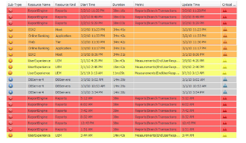
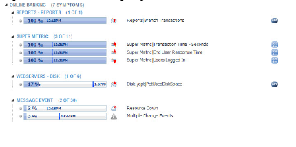
The Alerts widget lists alerts for selected resources and provides a convenient way to view and manage alerts. When you double-click an alert in the Alerts widget, the Alert Summary page appears and shows more detailed information about the alert.

Alerts WidgetAlerts Widget
Click to enlarge

Application Detail Widget
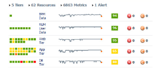
The Application Detail widget shows information for a selected application. The top of the widget shows the number of tiers, resources, and metrics that the application contains and the number of Smart Alerts and classic alerts on the application. The Application Detail widget does not show information for child resources

Application Detail WidgetApplication Detail Widget
Click to enlarge

Application Overview Widget
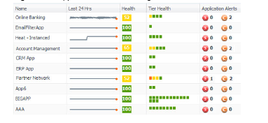
The Application Overview widget can list all of the applications in the enterprise, or only applications that you select. The widget shows a health graph for the last 24 hours, the current health score, the current health of each tier, and the number of alerts for the application itself. You can double-click an application to open its Application Detail page.

Application Overview WidgetApplication Overview Widget
Click to enlarge

Configuration Overview Widget
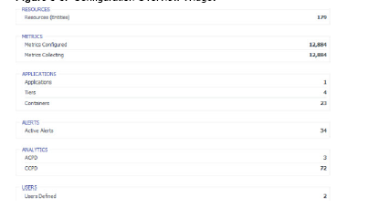
The Configuration Overview widget shows the current uptime functional status of defined resources, applications, and collected metrics for the environment.

Data Distribution Analysis Widget
The Data Distribution Analysis widget shows a graph for selected metrics. For each metric, the graph shows the data distribution of the metric, including how often it had a particular value.


Generic Scoreboard Widget
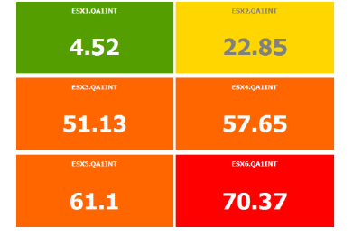
The Generic Scoreboard widget shows the current value for each metric that you select. Each metric appears in a separate box. The value of the metric determines the color of the box. You define the values for each color when you edit the widget. If you point to a box, the widget shows the source resource and metric data.

Generic Scoreboard WidgetGeneric Scoreboard Widget
Click to enlarge

GEO Widget
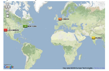
If your configuration assigns values to the GEO Location resource tag, the GEO widget shows where your resources are located on a world map.

GEO WidgetGEO Widget
Click to enlarge

Health Status Widget
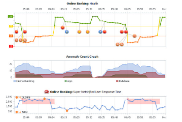
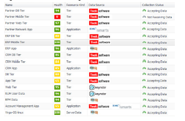
The Health Status widget shows the health score for selected resources. Health status is a 0 to 100 ranking that vCenter Operations Manager determines for each resource. For each resource, the widget includes the current health score and a graph that shows how the health score has changed over time.

Health Status WidgetHealth Status Widget
Click to enlarge

Health Tree Widget
The Health Tree widget shows the section of your resource hierarchy around a resource that you select. The widget shows all of the parent container resources that hold the resource. If you select a container resource, the widget shows all of the child resources that the container holds.

Health Tree WidgetHealth Tree Widget
Click to enlarge

Health-Workload Scoreboard Widget
The Health-Workload Scoreboard widget shows the health or workload score of selected resources. The icons for each resource are color coded. Green indicates best performance, which is 100 for health or 0 for workload. Red indicates worst performance, which is 0 for health or 100 for workload.

Heat Map Widget
The Heat Map widget contains graphical indicators that show the current value of two selected attributes for resources that belong to tag values that you select.
Mashup Charts Widget
The Mashup Charts widget contains charts that show different aspects of the behavior of a selected resource. By default, the charts show data for the past six hours

Mashup Charts WidgetMashup Charts Widget
Click to enlarge

Metric Graph Widget
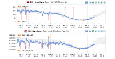
The Metric Graph widget shows a graph of the recent performance, and predicted future performance, of a metric. The important metrics count, which a vCenter Operations Manager administrator sets, determines the number of metrics that appear in the Metric Graph widget.

Metric Graph WidgetMetric Graph Widget
Click to enlarge

Metric Graph (Rolling View) Widget
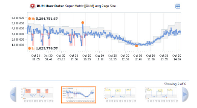
The Metric Graph (Rolling View) widget shows a full chart for one selected metric at a time. Miniature graphs for the other selected metrics appear at the bottom of the widget.

Metric Selector Widget
The Metric Selector widget shows attribute packages for one or more resources that you select in the Alerts, Generic Scoreboard, Health Status, Health Tree, Health-Workload Scoreboard, Heat Map, Resources, Root Cause Ranking, VC Relationship, or VC Relationship (Planning) widget.

Metric Selector WidgetMetric Selector Widget
Click to enlarge

Metric Sparklines Widget
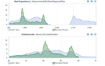
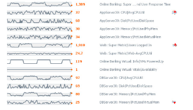
The Metric Sparklines widget shows simple graphs that contain the values of selected metrics over time and provides a quick view of the trends in KPIs.

Metric Sparklines WidgetMetric Sparklines Widget
Click to enlarge

Metric Weather Map Widget
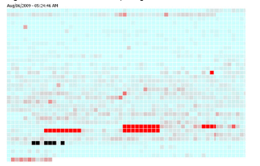
The Metric Weather Map widget provides a graphical display of the changing values of a single metric for multiple resources over time. The widget uses colored icons to represent each value of the metric. Each icon location represents the metric value for particular resources. The color of an icon changes to show changes in the value of the metric.

Metric Weather Map WidgetMetric Weather Map Widget
Click to enlarge

Resources Widget
The Resources widget lists the resources that are defined in vCenter Operations Manager.

Resources WidgetResources Widget
Click to enlarge

Root Cause Ranking Widget
The Root Cause Ranking widget provides an instant view of the probable causes of health degradation for a selected resource. The widget shows information about metrics on related resources that contributed to alerts on the resources, including the percentage likelihood that the metric contributed to the cause.

Root Cause Ranking WidgetRoot Cause Ranking Widget
Click to enlarge

Tag Selector Widget
The Tag Selector widget lists all defined resource tags and tag values. You can select one or more tag values to change the information that appears in the Alerts, Configuration Overview, Health Status, Root Cause Ranking, and Health Tree widgets.

Top-N Analysis Widget
The Top-N Analysis widget lists the top five items, or another number that you specify, of a type that you select. For example, you might select the five metrics that show the highest volatility or the five most or least healthy tiers in an application.

Top-N Analysis WidgetTop-N Analysis Widget
Click to enlarge

VC Relationship Widget
The VC Relationship widget provides performance and relationship data for objects in your virtual environment. It uses badges to represent derived metrics and give you a high-level, broad view of the performance and condition of your virtual environment.

VC Relationship WidgetVC Relationship Widget
Click to enlarge

VC Relationship (Planning) Widget
The VC Relationship (Planning) widget provides use and available badge metric information (risk, time, capacity, stress, efficiency, waste, and density) for the resources in your virtual environment.

Please note:- I have got the above mentioned information from the VMware’s Enterprise Getting started Guide”.

  • Modified logo BlogWithIntegrity.com
  • Recent Post

  • Tag Coud

    ESx Logs esxtop Licensing Logs Microsoft Cluster MSCS ODBC PowerCli Powershell Shape Data vCenter Logs vcops vcopsbadges Visio VMware vSphere

    WP Cumulus Flash tag cloud by Roy Tanck and Luke Morton requires Flash Player 9 or better.

  • Archives